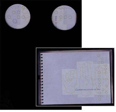
Student work for a fictitious paper company that would sell specialized Braille paper for printed works. The idea for this came from my realization that much of the projects we do as students are geared toward communicating to a visual audience. I opted to challenge myself by creating a project that would simultaneously be promoted to both visual and non-visual audiences. This led to some interesting discoveries such as the stock of the Braille paper was also the max weight for the laser printer. This project was also educational for me in that I borrowed a Perkins Braille Reader and, after some quick lessons, learned to type Braille for this project. The case that this book fits into is a custom opaque black Plexiglas® case; I assumed that since this was a specialized paper that this would also be a limited press run project for this fictitious company. The two drilled dots on the front of the case represent the letter "C" in the Braille alphabet — C for Communication, the theme throughout this promotion. The packaging for this project included a black Plexiglas® case with agate stones, a vellum separator, and a paper sample booklet.